1. Frequency tables — just counting
A frequency is simply a count — how many times something appears. A frequency distribution is the whole picture: a list of every category (or value) next to how often it occurs. List each category, write how many landed there, and you have a frequency table. Here's class_year for all 200 students in our dataset:
| Class year | Frequency (count) |
|---|---|
| Freshman | 56 |
| Sophomore | 51 |
| Junior | 54 |
| Senior | 39 |
| Total | 200 |
The counts add up to 200 because every student is counted exactly once — that total is your n. A close cousin is cumulative frequency: a running total as you move down the table (56, then 107, then 161, then 200). It answers "how many at this level or below?" — handy for questions like "how many students are Junior or earlier?"
2. Relative frequency — turning counts into %
A raw count of 56 doesn't mean much on its own — is that a lot? Relative frequency fixes that: divide each count by the total to get a proportion, then ×100 for a percent. This is what lets you fairly compare groups of different sizes: "28% of our class are Freshmen" can be compared to another class of 500 even though the raw counts differ wildly.
relative frequency = count ÷ total. So Freshmen: 56 ÷ 200 = 0.28 = 28%. Now you can say "28% of our students are Freshmen" — much clearer than "56."
📊 Try it — relative frequency
Type the count for each category. The calculator turns them into percentages and checks they sum to 100%.
3. Grouped tables — for numbers with too many values
Categories are easy. But commute_minutes has values like 4, 12, 27, 33, 51… List every one and you'd have a table a mile long that hides the pattern. The fix: group the numbers into bins (also called class intervals) — equal-width ranges — and count how many fall in each. A few rules keep bins honest:
- Equal width — every bin spans the same range (all 15 minutes wide), or the picture lies.
- No gaps, no overlap — every value lands in exactly one bin. (Decide up front that, say, 15 goes in the 15–30 bin, not 0–15.)
- About 5–8 bins — enough to show the shape without turning into noise.
Here's the real commute_minutes distribution — and you can change the bin width yourself:
Notice the trade-off the slider reveals: wide bins give you the big picture (most commute short, a few don't); narrow bins reveal detail but get noisy. There's no single "right" width — you're choosing how much to zoom, and an honest analyst tries a few.
4. Bar chart vs. histogram — the distinction people mix up
Both are made of bars. The difference is what's on the bottom axis — and it follows directly from Unit 1's scales of measurement.
| Bar chart | Histogram | |
|---|---|---|
| Use for | Categorical data (groups) | Quantitative data (numbers) |
| Example | class_year, gender, diet | commute, stress, GPA |
| Bars touch? | No — gaps between them | Yes — bars touch |
| Bars reorderable? | Yes (order is arbitrary) | No (number line has a fixed order) |
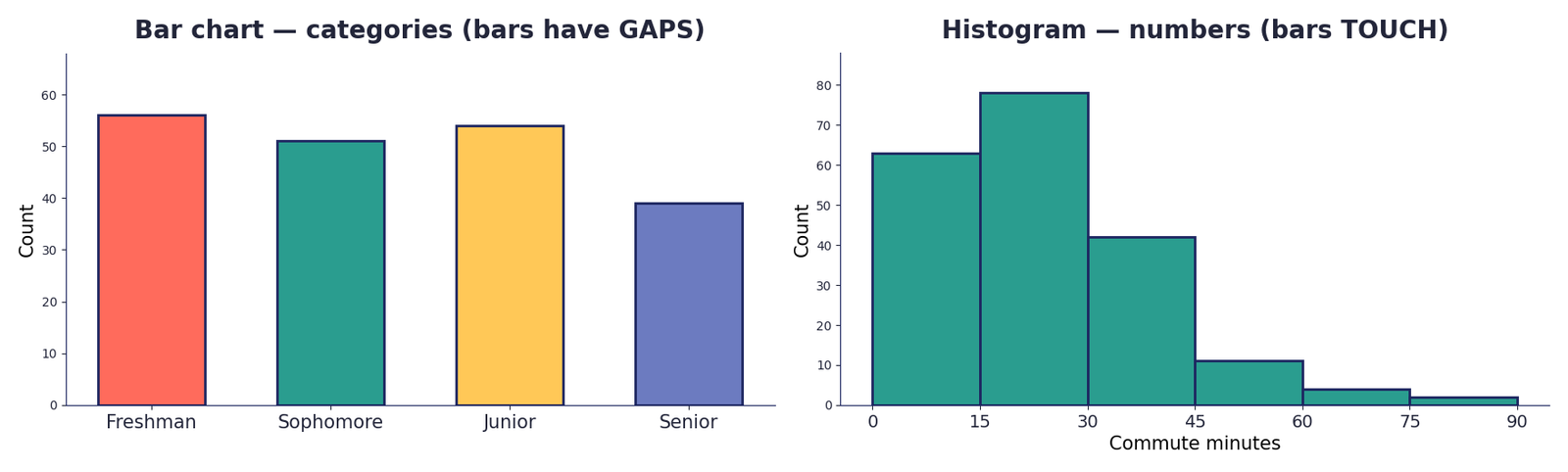
Counting groups (Freshman, Woman, Vegan)? → bar chart. Counting numbers split into ranges (0–15 min, 15–30 min)? → histogram. The bars touch in a histogram because the numbers flow continuously — there's no gap between "29 minutes" and "30 minutes."
diet (Omnivore, Vegetarian, Vegan). Which chart?5. Reading the SHAPE
Once you draw a histogram, its shape tells the story at a glance — and it previews ideas we'll formalize later (it secretly tells you how the mean and median will relate). Here's what the common shapes look like:
- Symmetric / bell-shaped — two halves mirror each other; scores pile in the middle (our
stressdata). Mean ≈ median. - Right-skewed (positive) — a long tail to the right; most scores low, a few high (our
commutedata). The tail drags the mean above the median. - Left-skewed (negative) — the long tail points left; most scores high, a few low. The mean is pulled below the median.
- Uniform — every bar about the same height; no real peak.
- Bimodal — two separate peaks, often a sign of two groups mixed together (e.g., two class sections).
Watch, too, for outliers — lone values far from the pack. They're often what create a skew, and they'll matter a lot when we pick a "typical" value next unit.
Skew points where the tail goes. Tail dragging right = right-skewed. The big bump is on the opposite side from the tail — a common exam trap.
🐮 The biggest distribution of all
Frequency distributions aren't just about our class. Each year, roughly 83 billion land animals are slaughtered for food — about 2,600 every second — and the species breakdown is itself a dramatic frequency distribution: about 90% are chickens. Drawn as a bar chart, one bar would tower over all the rest:
Slaughtered per year, by species
Ranked largest → smallest (millions of animals, 2021).
Our class dataset carries a quieter version of the same story. Here's the diet frequency distribution of all 200 students:
| Diet | Count | Relative frequency |
|---|---|---|
| Omnivore | 136 | 68% |
| Vegetarian | 46 | 23% |
| Vegan | 18 | 9% |
| Total | 200 | 100% |
Zoom out and the numbers reframe everything: meat and dairy use 83% of the world's farmland but provide only 18% of our calories (Poore & Nemecek, 2018). A "distribution" can carry real moral weight — and that's exactly the kind of thing we'll graph, unpack, and argue about in class.
💻 In Google Sheets
You don't count by hand — Sheets does it. Open the SJNY Student Life dataset and try:
=COUNTIF(C2:C201, "Freshman")        → counts how many Freshmen
56 / 200                              → relative frequency (0.28 = 28%)
Swap "Freshman" for each category to fill the whole table. For bins (number ranges), use =COUNTIFS with two conditions — at or above the low end, below the high end:
=COUNTIFS(W2:W201, ">=0",  W2:W201, "<15")   → the 0–15 bin
=COUNTIFS(W2:W201, ">=15", W2:W201, "<30")   → the 15–30 bin
To graph: highlight your table, then Insert ▸ Chart, and pick a column chart (categories) or histogram (numbers) in the Chart editor. Tip: put relative frequencies on the axis instead of counts when you want to compare two groups of different sizes.
Graphs can lie without a single false number — just by drawing the picture sneakily. The classic trick is a truncated y-axis: instead of starting at zero, the axis starts at, say, 95. A tiny gap between 96% and 98% suddenly looks enormous. You see it in ads ("4× more effective!"), cable-news charts, and product comparisons constantly.
The lesson: before you believe a bar chart, check the y-axis. If it doesn't start at zero, the differences are being exaggerated on purpose. A graph is an argument — make it prove its case.
Here's a worse offender than a truncated axis — a chart with no real axis at all. This one was shown to Congress in 2015, and it's been called one of the most misleading graphs ever published:
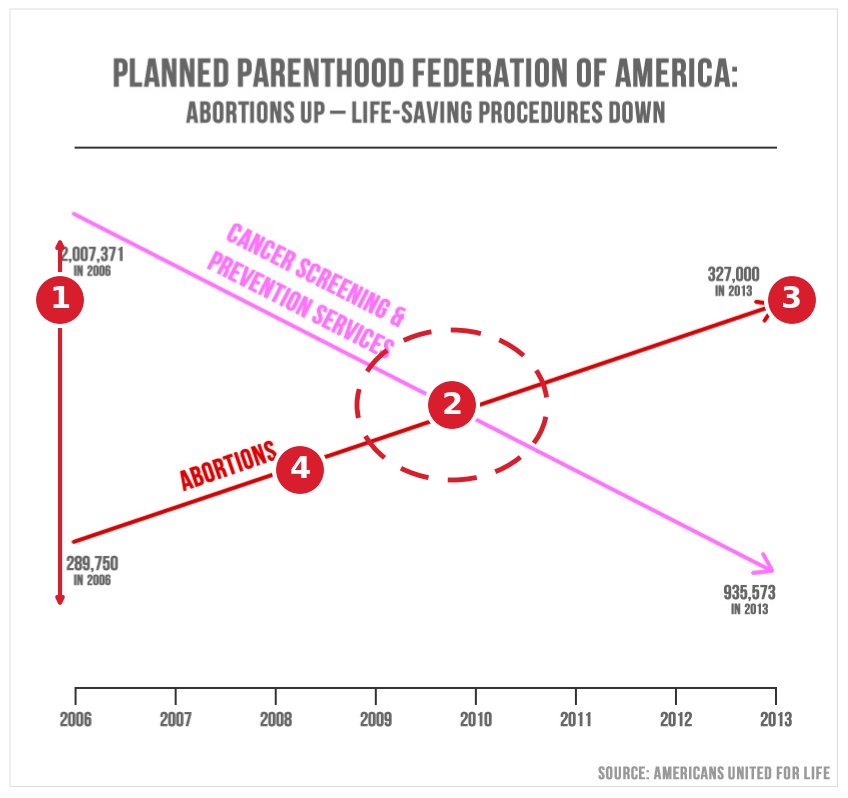
- No y-axis. There's no scale at all, so you literally cannot read either value.
- Two incompatible numbers, stacked to deceive. 327,000 abortions is drawn above 935,573 cancer-screening services — a smaller number placed higher on the page than one nearly three times larger.
- Exaggerated arrowheads fake a dramatic, ongoing trend the data don't support.
- Only two data points (2006 and 2013) are plotted; the straight line simply invents everything in between.
Plot both series on one axis that starts at zero and the lines never cross — cancer-screening services stay far above abortions the entire time. The dramatic "crossover" was manufactured by the drawing, not the data.
🗺️ The greatest graph ever drawn
You just saw how a graph can lie. Here's the opposite — a graph so good it's been called “the best statistical graphic ever produced” (Edward Tufte, 1983). In 1869 a retired French engineer named Charles Joseph Minard, then over 80, told the whole story of Napoleon's catastrophic 1812 invasion of Russia in a single picture:
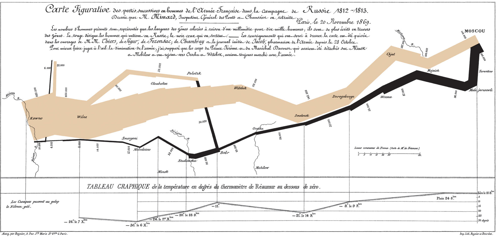
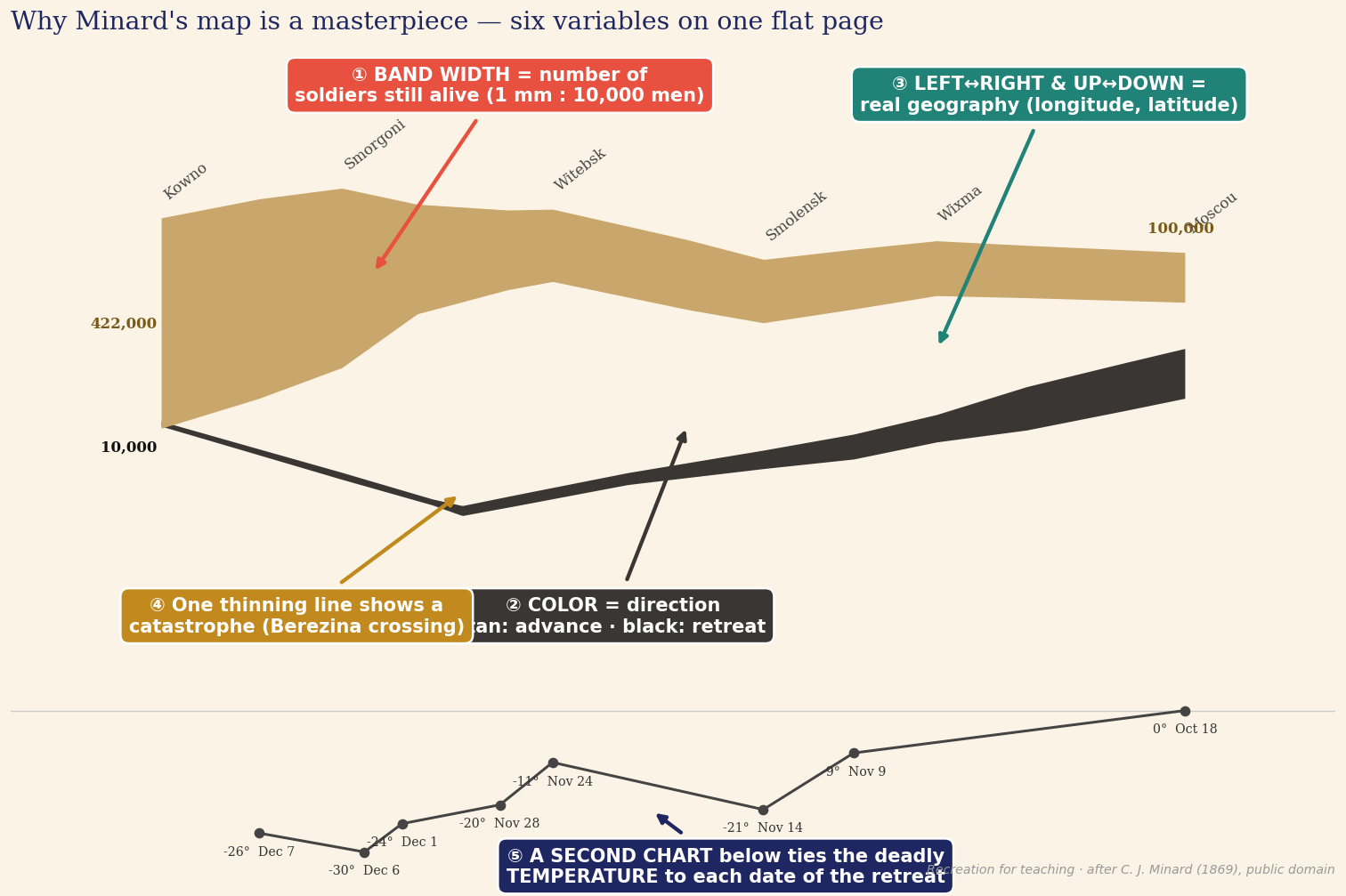
Read it like a story. The tan band is Napoleon's army marching toward Moscow, left to right — and its width is the number of soldiers still alive. It starts enormous (~422,000 men) and visibly withers from heat, hunger, and disease. The black band is the retreat, read right to left; it dwindles to a thread. At the Berezina river crossing the army is all but destroyed — only about 10,000 stagger home. Below, a strip plots the temperature during the retreat (−30° one December day): line up a plunge in the cold with a collapse in the black band, and you can see the winter killing them.
Minard packs six kinds of data into two dimensions: the army's size, the distance traveled, the temperature, the latitude and longitude, the direction of travel, and the dates. He said his aim was “to convey promptly to the eye the relation not given quickly by numbers.” That's the whole point of this unit: a good picture makes the truth obvious — no math required.
🏷️ How to label a graph
Minard's masterpiece works because every mark is labeled. Your own graphs follow the same anatomy — and most "bad graph" problems are really just labeling problems.
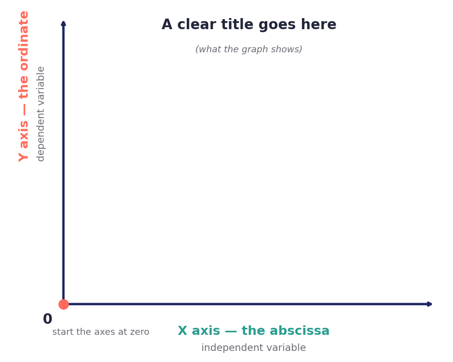
- A graph has two axes: the vertical Y (the ordinate) and the horizontal X (the abscissa).
- Put the independent variable on the X axis and the dependent variable on the Y axis.
- Start both axes at zero where you can — a true origin keeps comparisons honest (exactly what the chart crimes above broke).
- Label everything — both axes, the units, and a clear title — so the graph stands on its own.
If your graph needs a paragraph of explanation to make sense, it isn't labeled enough. A good chart tells its one story by itself.
✔️ Ten things to keep in mind
A quick checklist to run before you call any graph finished:
- Cut the chart junk. Every extra gridline, 3-D effect, and decoration buries your point — less is more.
- Plan it before the final draft — sketch it on paper first, even if a computer will draw it.
- One graph, one idea. Showing two things? Make two graphs.
- Label everything — leave nothing to the reader's guess.
- Center the title and axis labels; keep the layout balanced.
- Keep the scale honest — roughly a 3:4 height-to-width ratio, and axes that start at zero.
- Simple, not simplistic. Strip the clutter, but keep the substance.
- Use as few words as possible.
- Say exactly what you mean — no more, no less.
- It must stand alone. If the chart can't carry the message by itself, go back to your plan.
Counts (56) vs. percents (28%) are different things — label which you mean. Bins must be equal-width and not overlap. "Skewed right" means the tail is on the right even though most data sit on the left. And always check a chart's axis before trusting how big a difference looks.